

DePalma Studios Website Redesign
DePalma is a design & innovation studio that helps businesses solve problems, seize opportunities and realize their goals. DePamla wants to build a "world class" website that reflects the creativity and expertise of its employees.
Specifically, DePalma wants a focused digital approach to client engagement that speaks to targeted personas and will drive sales. The current website has a significant hole in the sales funnel resulting in a ~70% visitor bounce rate from the existing landing page. Users are being trafficked from DePalma’s stellar Clutch profile to an underwhelming website where the majority drop out of the funnel.
Lead UX & Design — Matthew Whiting
Designer — Tatiana pupko
Illustrator — Ana Hill
The UX Process

I began the discovery process with end-user and stakeholder workshops in order to identify the problems of the current website and to define the goals for the redesign.
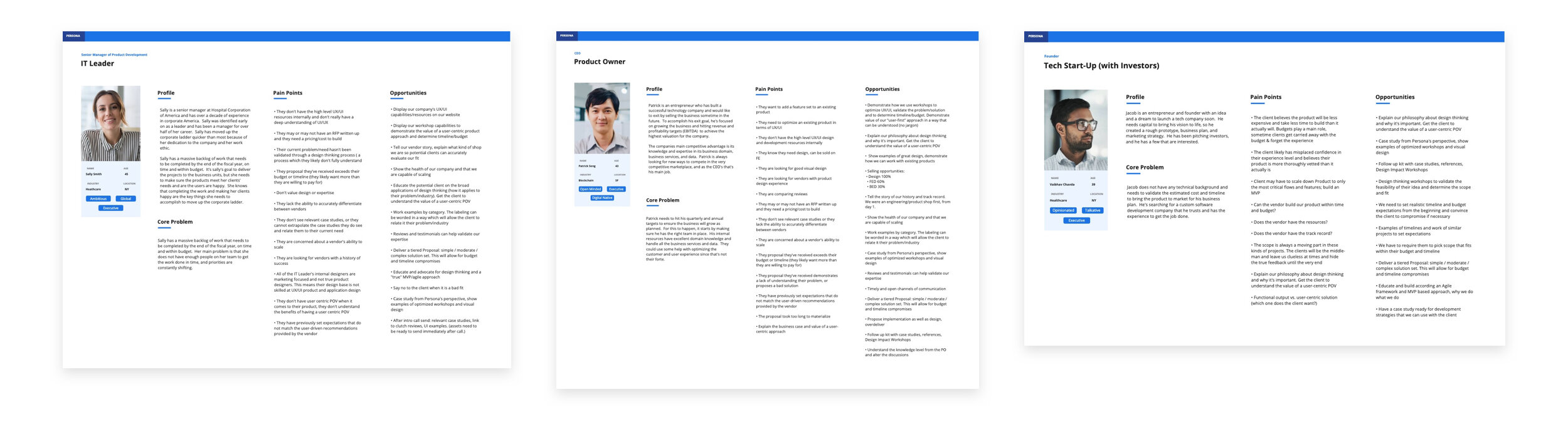
One of the stated goals of the redesign was to identify and target specific customer personas that are pivotal to DePalma’s business.

Once the personas were identified we mapped their path through the sales cycle using service design journey maps. This allowed us to identify the user’s pain points and the studio’s opportunities and engagement touchpoints.
After users’ journeys were mapped we designed a feature and flow architecture that accommodated their needs and reduced their pain points.
The Branding Process

Similar to the UX workshops, I conducted a branding workshop with the stakeholders to determine the studio’s perceived value proposition, story and personality.
We then undertook a competitive brand analysis of companies that DePalma Studios stakeholders admire.
We created style tiles based on the attributes gleaned from the brand workshop.
An excerpt from the design system.
Via Dribbble I found the amazing and talented Ana Hill whose illustration style perfectly captured the look and feel we were going for.
Conclusion
A lot of hard work from a talented group of people came together to create a website that reflected DePalma’s values and level of design maturity. As it gets built out I look forward to testing whether we’ve successfully closed the funnel gap between DePalma’s stellar Clutch reviews and web presence.